


DENVER — The Denver Nuggets' jerseys have seen a slew of different color combinations and logos over the decades.
Their uniforms ranged from basic and plain to colorful and eye-catching.
The Nuggets are headed to the NBA Finals against the Miami Heat, with game one kicking off on Thursday evening at Ball Arena in Denver. You can watch all of the games live on Denver7 and check out the schedule here.
READ MORE:
- Is Michael Malone the most underrated coach in Denver sports history?
- 'The approachable superstar': Nuggets fans share stories about meeting Nikola Jokić in person
- What’s in a name: Nikola Jokic, Nikola Jovic to square off in Nuggets-Heat NBA Finals
- Denver Nuggets mural on Colfax grabbing Nuggets Nation's attention
- Denver Nuggets perfect the drama-free path to their spot on NBA's big stage
- Championship formula? Similarities between Nuggets and previous Denver champs
- How the 2011 Carmelo Anthony trade is still paying off for Nuggets ahead of 2023 NBA Finals
- Remember when Taco Bell's quesarito was a bigger deal than Nikola Jokić's draft pick
The Nuggets posted photos of the Finals threads on Twitter.
Work attire for the first four games 👔
— Denver Nuggets (@nuggets) June 1, 2023
See ‘em in person: https://t.co/33uzMJdsap pic.twitter.com/HKmnYanCwL
Ahead of the franchise's first-ever Finals, we're taking a look back at the different eras of the Nuggets' visual history. We enlisted the help of a sports branding expert to take us through the years:
The Rockets era (1967-1974)
The Denver Nuggets, then known as the Denver Rockets, started in the ABA with a red-and-white look in 1967.
In the early 1970s, they switched it up a bit with a different color combination — green and white for home games and purple and yellow for away with "Denver" written in the chest.
In the final year as the Rockets, the team dropped the green and stuck with a purple and yellow combo.
"Their visual history, which was actually pretty sedate in those early days, gets a little bit more interesting because they go with Columbine blue and gold uniforms – almost lavender looking, very distinctive and very much of the the Technicolor and polyester age," said Todd Radom, a writer, designer and sports branding expert.
The first appearance of the pickaxe (1976-1977)
The Nuggets officially joined the NBA in the 1976-1977 season.
The pickaxe appeared on the Nuggets' jerseys for that first season, but it looked a lot different than the modern logo. Against a dark blue uniform was a red circle and crammed inside were the pickaxe, a lump of gold, and the word "Denver" or "Nuggets."
It remained a central part in the uniform until the end of the 1977 season, when the uniforms were more simplified.
"They become the Nuggets and all of a sudden there's this very expressive moment, where they gained brand personality, they introduced Maxie the Miner," Radom said. "They introduced some pretty funky uniforms, which of course coincide with the final moments for the ABA.
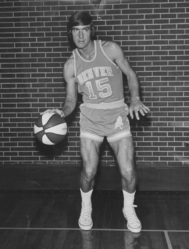
Navy blue (1977-1982)
For several seasons, the Nuggets adopted a jersey with "Nuggets" written across the chest in a royal blue with gold trim for their home games. The away jerseys, which were dark blue, had "Denver" written in white in the same place.

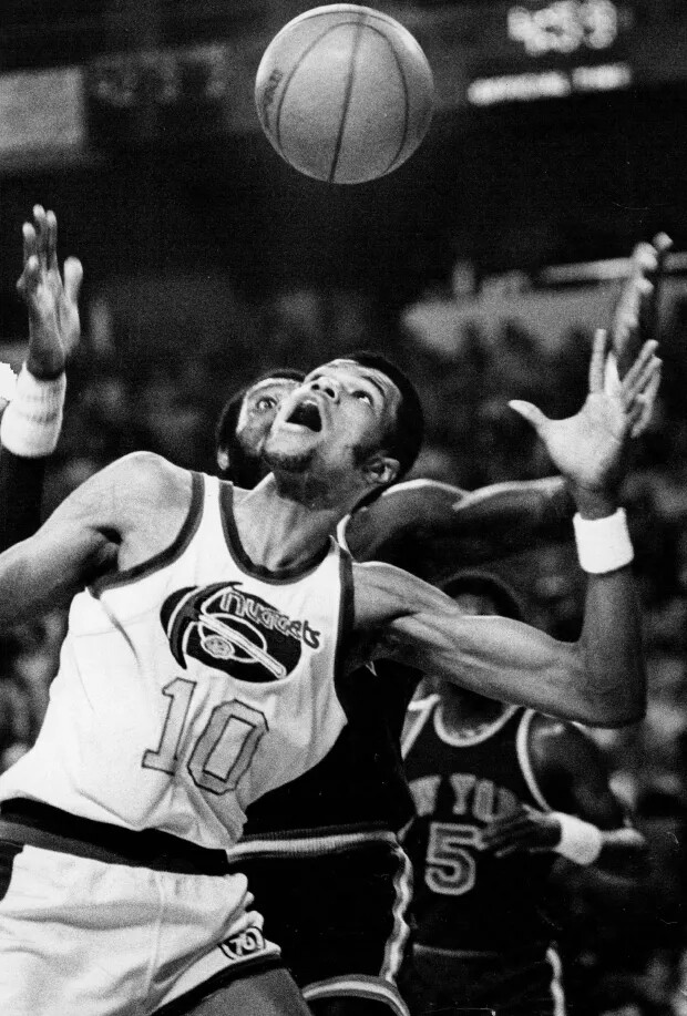
The rainbow era (1981-1993)
In the 1980s through the early 1990s, the Nuggets jerseys featured a bright rainbow skyline of the City of Denver with white mountains for both their home and away games.

The word "Nuggets" was underneath the illustration with the player number above.
"These are uniforms that are very unique. [...] It kind of looks like a Tetris," Radom said. "It's very of its era, of course, [with] seven colors – something that we would not normally do today."
The Nuggets made nine consecutive playoff runs in the rainbow skyline era – with legendary players like David Thompson, Dan Issel and Alex English wearing it – cementing the look as one of the most iconic in franchise history.
This style was brought back for the 2012-2013 season as alternate jerseys.
A new, dark blue theme (1993-2003)
Beginning in 1993, the Nuggets changed their look significantly from the rainbow days. Their uniforms for this period were navy blue, gold and maroon.

"Nuggets" was still written across the chest. The jerseys had red, gold and black accents along the arm and neck holes.
Radom said the darker look coincided with the push for a new arena in Denver, and a pop culture movement in the 1990s.
"This was kind of a unifying theme across professional sports in the 1990s," he said. "And it has to do with kind of this tacit appeal to youth that was taking place in more aggressive logos [and] darker colors."
The team kept this style for a decade.
Powder blue takes the stage (2003-2017)
In the early 2000s, the jerseys took on a lighter color. And so the era of the powder blue jerseys began. Their logo stayed the same as the mid-90s, but had the new color change, which included yellow text.

"By the turn of the 21st century, things had peaked and things started to kind of move backwards to perhaps a more calm space, and the Nuggets rebrand toward powder blue and yellow gold really is reflective of that," Radom said. "You had a number of teams which I say devolved at that particular time."
"The Nuggets were definitely one of them," he added.
Present-day dark blue (2017- present)
For the 2017-2018 season, the light uniform from years past was replaced with a return of the navy blue last used in the 90s and early 2000s. This year, Western Union became the team's jersey sponsor and their logo was placed on the shoulder of the jerseys.
The following season brought multiple color and logo combinations, mostly as a nod to the team's history. While the powder blue was gone, both yellow and red made a return, the latter from the Rockets days.
In more recent years, the team has used a home uniform that was navy blue with yellow text reading "Denver" across the chest.

Alternate jerseys
NBA teams started regularly using third jerseys in the mid-1990s, but it picked up steam and became much more popular in the 2000s and 2010s.
Below are some of the fan favorite modern-day alternate jerseys that the Nuggets have worn in the past decade.
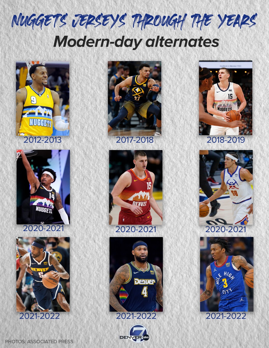
Let's start with the yellow mountainscape jersey. It first made an appearance on the court in 2012 and was used through 2018.
Afterward, the team used a city jersey that gave a nod to the team's origins, with crossed yellow pickaxes in the center. The popular rainbow jerseys were brought back as alternates for a couple years as a throwback to the 80s and early 90s.
The Nuggets then grabbed an older jersey, all the way from their Rockets days, and reintroduced the same horizontal mountain look, but in red and orange. After qualifying for the 2020 playoffs, their "earned" jerseys were brought in — a stark white with red and blue crisscrossed pickaxes after the player's number.
After 2021, multiple different alternate jerseys were used. Some were brand new and others used aspects or colors from decades prior. Some of the ones from this year featured the familiar rainbow Tetris pattern once again.
In 2022, the NBA announced the Nuggets new version of the Mile High City jerseys, which featured more gold than previous iterations used since the 2018-2019 season.
Radom described the alternate jersey phenomenon a "chaotic visual experience" in today's NBA, but said the Nuggets have found a balance between the past and present."
"They have a pretty defined look," he said. "The idea of them being the Mile High City is, of course, extremely ownable."
"I personally enjoy the more bright blue and gold color scheme because I think of Denver and I think about how this look really harkens back to the early days in the NBA in the last couple of years in the ABA."
Now, let's hear from you! What has been your favorite Denver Nuggets logo? Vote below.