DENVER — It was the year of the Delorean, the first space shuttle launch and a most-watched royal wedding.
It was 1981 and you could buy a house for $100,000. For less than 3-bucks, you could buy a ticket to see the hit movie ‘9 to 5’.
It was that same year when a young, aspiring artist came to Colorado bringing with him one of the most iconic looks longtime Denver Nuggets fans will most definitely remember.
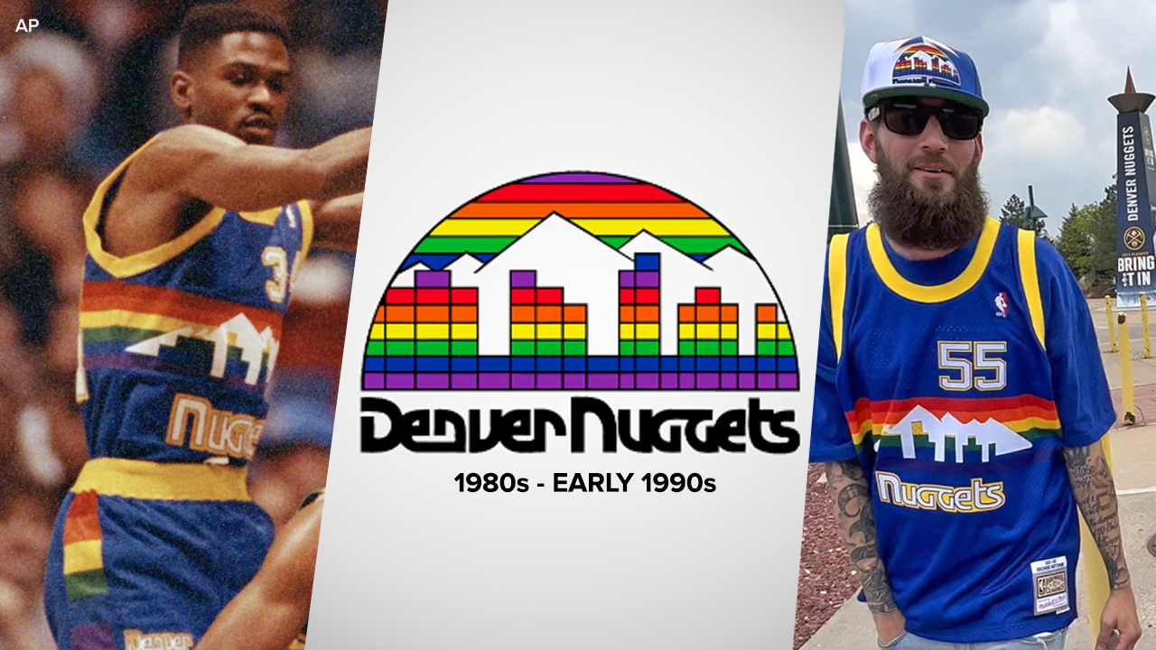
Here’s the brief history of how the very 80’s, Tetris-looking Denver Nuggets logo totally rocked the decade.
Todd Radom, graphic designer and sports branding expert has a lot to say about the bright, flashy and rad logo.
“I always say, you know, we, as sports fans, gravitate toward the look of our teams from when we grew up,” said Radom. “So, when I think of the Denver Nuggets, I think of those early NBA days.”
As the calendar was about to flip to a new decade, Nuggets team leadership was looking to make a change from the red and blue logo of the miner with a pick axe and basketball.

Denver Nuggets
From simple to iconic, take a look at the Nuggets' jerseys through the years
That’s when the idea of a contest came about in the 1981 season thanks to a former Nuggets executive.
“So here it all goes back to Carl Scheer, who again – a guy who's promotional genius really steered this whole project forward,“ said Radom.
Scheer was a key figure in team history who helped transition the Nuggets from the ABA to the NBA in 1976. It was his idea to launch the logo contest to rebrand the Nuggets.
While it was Scheer’s idea to do the contest, the winning design that would become a colorful, visual symbol of the team and the city would go to young, aspiring Kerry Bowers.
“The story is that he came to Colorado in search of pursuing an artistic career. Not sure it worked out, but he created this logo,” said Radom.
The winning design was selected from over 500 entrants hoping to create the next Denver Nuggets logo.
“It's very, of its era, of course, seven colors, something that we would not normally do today,” said Radom.
Radom said the thought at the time was Scheer wanted a visual representation that was more reflective of Denver going into the 1980s.
“I’m paraphrasing here, and he said the red and blue colors had really gotten stale. And boy, when these uniforms and logos were launched, it really propelled the franchise into a very different space.” said Radom.
The new Nuggets logo for the 80s was bright and flashy featuring an iconic Denver skyline. It was a look that would appear on shirts, jerseys and flags across the city through the early 1990s when the team decided to make another change.
The 1980s had been a good decade for the Nuggets, so why rebrand from the iconic look?
Radom said the Nuggets followed a trend back then ditching a seven-color logo to something that created a unifying theme across professional sports teams when the Avalanche moved to Colorado in the 1990s.

Denver Nuggets
The $4M contract that almost bankrupted the Nuggets in the early 80s
“So when the Avalanche moved from Quebec to join the NHL in 1995, win the Stanley Cup, their branding aligns with the look of the arena and the look of the Nuggets,” said Radom.
The Denver Nuggets adopted a new logo, with darker blues and reds in the 1993-1994 season. That new version of the logo stuck around with only updates to colors before the current Nuggets logo launched five years ago, once again with a pick axe.
But if you ask many longtime Denver Nuggets fans to pick their favorite team logo, there’s really only one bodacious choice.
“The skyline look is so audacious – so very unique and ownable to that franchise. I think if I had to close my eyes and kind of pick one or the other, it would be that.” said Radom.
Now, let's hear from you! What has been your favorite Denver Nuggets logo? Vote below.


